Tailwind emerged in 2017, survived the hype of new technologies and it is now present in many projects and in the standard installation of frameworks, such as NextJS. Tailwind makes styling much simpler, faster, and enjoyable.

I've become a Tailwind evangelist, so I'd like to share its key features and how I use it in my daily work.
In this blog post, I'll be covering the following topics:
- How it works
- Utility Classes
- Custom Theme
- Custom Properties
- Using Media Queries
- Hover, actived, disabled and other states
- Using !important
- Using negative values
- Targeting first and last element
- Peer
- Nested Elements
- Improving readability with @apply
- Using prefix
- Playground
For more information on installation and configuration, please refer to the official Tailwind documentation.
How Tailwind CSS works
Tailwind utilizes HTML classes to apply CSS styles. For example, we can define the color, size and line-height of a text as follows with Tailwind.
<p class="text-red-500 text-base">Hello, World!</p>
In contrast, with pure CSS, we would have to create a class and use it in the element.
.text {
    color: red;
    font-size: 12px;
    line-height: 18px;
}
<p class="text">Hello, World!</p>
And with styled-components, we would need to export a component, import it, and use it. Typically, this element would be in a separate file.
export const Text = styled.p`
    color: red;
    font-size: 12px;
    line-height: 18px;
`;
import * as Styles from './styles.js';
// ...
<Styles.Text>Hello, World!</Styles.Text>
As you can see, we can achieve the same result by writing much less code with Tailwind.
Utility Classes
At first, it may take some time to memorize the classes, but they follow a pattern, and over time, it becomes natural. The official documentation provides a list of all classes, but the most commonly used ones are:
w-x- Widthh-x- Heightp-x- Paddingm-x- Marginmb-x- Margin-bottommt-x- Margin-topml-x- Margin-leftmr-x- Margin-rightpx-x- Padding-left & padding-rightmy-x- Margin-top & margin-bottomtext-x- Font-size & colorleading-x- Line-heightbg-x- Background-colorrounded- Border-radiusflex | block | hidden | grid- display: flex | block | none | grid
Read more in the official documentation
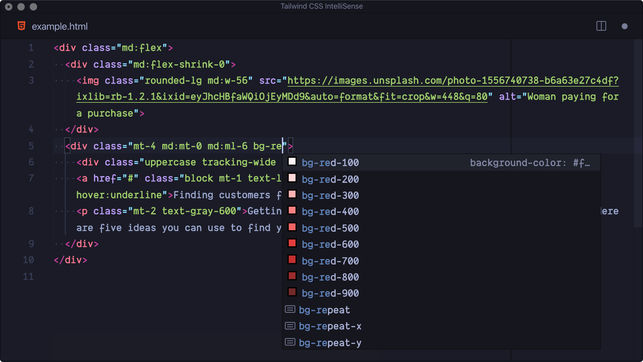
I highly recommend using the VSCode Tailwind CSS IntelliSense extension, which suggests and shows the values of all classes as you type.

Custom Theme
Tailwind comes with a default theme, but you can customize it to meet your project's needs.
To do this, simply create a tailwind.config.js file at the root of your project and define the properties you want to customize.
module.exports = {
  theme: {
    extend: {
      colors: {
        'blue': '#1fb6ff',
        'green': '#13ce66',
        'gray-dark': '#273444',
      },
      spacing: {
        '144': '36rem',
      },
      borderRadius: {
        '4xl': '2rem',
      }
    }
  }
}
Read more in the official documentation
Custom Properties
The Tailwind theme has a wide range of properties and styles that probably cover your design specifications.
However, if you happen to need a property that does not exist in your theme, you can define a different value using -[x], for example.
<p class="text-[red] text-[100px] w-[50%]">Hello, World!</p>
For properties with spaces, you can use an underscore _ to separate the values.
<p class="w-[calc(100%_+_10px)] shadow-[0_35px_60px_-15px_#333]">Hello, World!</p>
Read more in the official documentation
Using Media Queries
To use breakpoints, you can use the prefixes sm:, md:, lg:, and xl:.
<p class="text-red-500 sm:text-blue-500 md:text-green-500 lg:text-purple-500 xl:text-yellow-500">Hello, World!</p>
To change the sizes of the breakpoints, simply modify the screens property in the tailwind.config.js file.
module.exports = {
  theme: {
    screens: {
      'sm': '576px',
      // => @media (min-width: 576px) { ... }

      'md': '960px',
      // => @media (min-width: 960px) { ... }

      'lg': '1440px',
      // => @media (min-width: 1440px) { ... }
    },
  }
}
Read more in the official documentation
Hover, actived, disabled and other states
Tailwind also uses prefixes to style an element depending on its state, such as hover:, focus:, active:, and disabled:.
<button class="bg-blue-500 hover:bg-green-500 disabled:bg-slate-600">Click here</button>
Read more in the official documentation
Using !important
To use the !important property in CSS, simply add the ! prefix before the class.
<p class="!mb-0">Hello, World</p> <!-- margin-bottom: 0 !important; --->
Read more in the official documentation
Using Negative Values
To use negative values, simply use the - prefix before the class.
<p class="-mb-4">Hello, World</p> <!-- margin-bottom: -1rem; --->
Read more in the official documentation
Nested Elements
To style a child element, simply use the &> prefix inside brackets.
<div class="text-blue-700 hover:[&>.text]:text-red-700 ">
    <p>I'll not be red on hover.</p>
    <p class="text">I'll be red on hover.</p>
</div>
Read more in the official documentation
Targeting first and last element
Instead of using :not, :last-of-type, :first-of-type selectors to customize the first or last element of a group of sibling elements, simply use the first: and last: prefixes.
<p class="text-red-600 last:text-blue-600">...<p>
<p class="text-red-600 last:text-blue-600">...<p>
<p class="text-red-600 last:text-blue-600">...<p>
This is very useful in loops.
<ul>
    {#each people as person}
       <li class="mb-10 last:mb-0">...<li>
    {/each}
<ul>
Read more in the official documentation
Peer
To style an element depending on the state of its hierarchical sibling, use the peer class and prefix.
<input type="email" class="peer"/>
<p class="invisible peer-invalid:visible text-pink-600">
    Please provide a valid email address.
</p>
Read more in the official documentation
Improving readability with @apply
Some argue that a disadvantage of Tailwind is that it makes the code less readable by adding so many classes in the HTML.
<p class="text-base text-gray-800 mb-3 last:mb-0">Text 1</p>
<p class="text-base text-gray-800 mb-3 last:mb-0">Text 2</p>
<p class="text-base text-gray-800 mb-3 last:mb-0">Text 3</p>
<p class="text-base text-gray-800 mb-3 last:mb-0">Text 4</p>
While this may be valid, you can use @apply to group classes, reuse them, and make the code more legible.
.my-text-base {
    @apply text-base text-gray-800 mb-3 last:mb-0;
}
<p class="my-text-base">Text 1</p>
<p class="my-text-base">Text 2</p>
<p class="my-text-base">Text 3</p>
<p class="my-text-base">Text 4</p>
Read more in the official documentation
Using Prefix
If you want to add Tailwind to a project and avoid conflicts with other classes, you can add a tw- prefix to the Tailwind classes.
module.exports = {
  prefix: 'tw-',
}
<p class="tw-text-blue-400">Hello, World!</p>
Read more in the official documentation
Playground
Tailwind has a playground where you can test all these features and more online. Just visit the link.
Conclusion
Since I started working with Tailwind CSS, I rarely needed to create a new CSS file or rewrite properties to add style to a project.
In case I haven't convinced you to start using TailwindCSS yet, there are another points that I consider important to highlight.
- TailwindCSS is light and only adds to the final bundle the classes that you used during the development.
- TailwindCSS is easy to set up, customize and start working on any web project, weather using React, Angular, Vue or just HTML.
- TailwindCSS can be used with other UI solutions, such as UI libraries, preprocessors and CSS-in-JS.
I hope you enjoyed this my blog post. If you have any questions, feel free to ask in the comments section below.